| ||||||||||||||
| Public Boards/Advanced | ||||||||||||||
|
comd
(Apr 2, 2006)
Trying a bit more than a head this time since I have all this canvas space in the advanced section. I'm just going to try to copy the photo directly this time as closely as possible.http://www.kristiaknowles.net/images/gallery/fitness/fit2.jpg I'm not sure I'll get anywhere. Thanks all for the encouragement. [Edit] This is the opposite of what I'm striving to do artistically as my goal is to draw more loosely from references (using information from the reference to make a completely different picture, not drawing the reference) and ultimately without needing references at all, but I wanted to try a shot at being unpainterly and more photorealistic: the antethesis of what I've been trying to do. To get the line drawing and major landmarks as accurately as possible, I initially started with a grid for the line drawing. This allowed me to shade and color more loosely without worrying about correcting inaccuracies from the previous stages. I don't think I quite got there as I still got lazy on the shading and didn't quite interpret the values correctly. It looks correct sized down, but not up close. |

| |||||||||||||
|
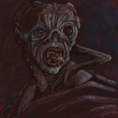
comd
(Apr 1, 2006)
Nothing has been popping out to me from the blank canvas to doodle, so I went back to trying to draw from a photo again, but this time I played around with features even more than usual.Reference photo: http://gallery.amazon.ee/view_photo.php?set_albumName=European_Championships_2005&id=abh I was originally planning to do an orc and sought out a scary-looking bodybuilder for the reference, but I ended up with a wizard instead. This is my first attempt at submitting something in the advanced category. I hope it's okay: I spent ages on it, and I wanted to have the extra space available for revisions since I'm always running out of space.
woah_pockster (Apr 2, 2006)
I'm loving all of your work dear, this definatly belongs on advanced. keep up the good work, can't wait to see what you do next =] <3
Opium (Apr 2, 2006)
I really like this! did you really spend that much time on this?? Now that's patience. He looks so much like someone I know....I can't put my finger on it...
Sweetcell (Apr 2, 2006)
Wow just..... wow. You belong, believe me.Reminds me of General Zod from Superman. Without the crown. Version 1 looks like a comicbook panel. Version 2 looks like a bronze statue. And the 3rd I mentioned. WOWZERS.
Miss_DJ (Apr 3, 2006)
just awesome! love the tendons in his neck..yowza. |

| |||||||||||||
| Public Boards/Beginner | ||||||||||||||
|
comd
(Mar 30, 2006)
123
Moosh (Mar 31, 2006)
...Yikes. D:
davincipoppalag (Mar 31, 2006)
This would have been great when we were all doing Halloweeny pics ..hehee she sorta looks like Rush Limbaugh.. hehe
zep (Mar 31, 2006)
nice!! i like the colouring...and the face of course :) |

| |||||||||||||
|
comd
(Mar 29, 2006)
Just doodling around.
davincipoppalag (Mar 29, 2006)
I keep seeing more things in that guy. This is very imaginative.
Skai (Mar 29, 2006)
DOODLE MORE. <333
IkariIreuL (Apr 25, 2006)
Looks like that alien from simpsons
Sweetcell (Apr 25, 2006)
I wish you would work on this a bit more comd, it's a fabulous detailed piece. Color color color.... |

| |||||||||||||
| Public Boards/Intermediate | ||||||||||||||
|
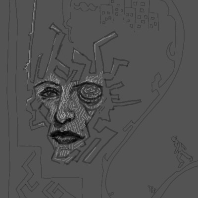
comd
(Mar 29, 2006)
Was trying to draw a female face without reference but ended up hating the result, so I started messing with the right eye which I especially disliked and then ultimately just started doodling random, disjointed shapes all around her face.
woah_pockster (Mar 30, 2006)
very cool <3 I'm surprised there aren't more comments =]
Sweetcell (Apr 1, 2006)
It has a Giegeresque feel to it. This will be great.
DeadlyBlondeArcher (edited Apr 1, 2006)
pretty cool stuff, David...looks a little bit like one of the coneheads from Saturday Night Live... :) (I like the labyrinth design inside the outline of her face) |
| |||||||||||||
|
comd
(Mar 29, 2006)
Searching for a feeling or a shape while watching T.V.I couldn't find any shapes I wanted in my original scribble, but the void gave me some ideas. Couldn't really find shapes, so I went with the mood I felt from the void after tinting it with a red background and some blue darks.
davincipoppalag (Mar 29, 2006)
Creepy lookin fella! |
| |||||||||||||
| Public Boards/Beginner | ||||||||||||||
|
comd
(Mar 25, 2006)
Just trying to construct heads some more without a reference. I really need help. This one is really boring and symmetrical because of the angle, but I don't think I'm ready to tackle 3/4 views yet (sometimes I can pull them off, but only when I'm lucky - I'm tired of depending on luck).I stopped using antialiasing at the advice of Maiko since it makes the files take so much more space which, in turn, ends up limiting the number of revisions I can make. Besides, the antialiasing doesn't really help me for practice drawings.
davincipoppalag (Mar 25, 2006)
If you can do this without a reference , you're already way ahead of most here. If this is boring, put horns on him , or give him an unusal mouth or ears. I didn't know antialiasing made the files larger, thanks for that.
comd (edited Mar 25, 2006)
Thanks danvincipollag. I want to be able to tackle some complex angles. This one was just a straight on shot, so I just tried to draw fairly symmetrical here. I still got the eyes pretty off. :( I noticed in the thumbnail for the earlier revisions that one was quite a bit higher than the other. I'm still quite stuck at just drawing heads. I still have a long way to go before I can draw full-figured characters at any angle I want without creating a picture I hate. For the antialiasing, it makes a huge difference in file size. I think I would have went past my limit already by now if I had turned it on. |

| |||||||||||||
|
comd
(Mar 25, 2006)
Trying to get a feel for what it takes to make a human head (not necessarily realistic: just something I could comfortably draw without a reference - could be cartoonish). I am having serious perspective problems. Maybe I should start off with a cube to get a feel for the correct angle and how to place the features in proper symmetrical form. I ended up drawing those horizontal and vertical lines towards the end only to realize that features were really assymetrical/lopsided.
Kloxboy (Mar 25, 2006)
That looks cool, now that piece has contours. ;)Reminds of Doze Green's work a littlle but more sketchy and structured.
davincipoppalag (Mar 25, 2006)
If people's faces were absolutely symmetrical, there wouldn't be nearly as much variety in what they look like. The imperfections and off-angle features are what make interest. Why be perfect?
comd (edited Mar 26, 2006)
Ah definitely, but I'd like to add asymmetry once I can draw things properly in perspective symmetrically, otherwise I'll just end up passing off my mistakes as asymmetrical features of the character. That works, but I'd like to be in more control rather than letting my mistakes dictate the look of the character. |

| |||||||||||||
| Public Boards/Intermediate | ||||||||||||||
|
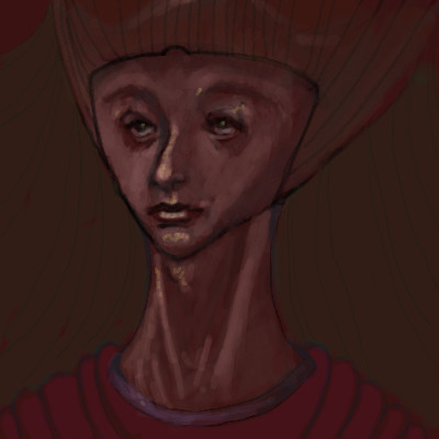
comd
(Mar 25, 2006)
I was trying to doodle a weird alien woman (actually it started off as an attempt to draw a human head without a reference, but I was screwing things up so I went with alien), but I started to like it too much as a human towards the middle, so it just came out as a weirdly drawn person. I think I ended up being influenced by Zinc's picture of Queen Amidala, so she turned out being queen-like. I hope he doesn't mind. She ended up just being a weird, disproportionate human with a weird hat.She had some pretty features and I decided against turning her into an ugly alien.
DeadlyBlondeArcher (Mar 25, 2006)
Looks like an Egyptian idol of sorts that you might find in a tomb :) Really creative and interesting, I like how it turned out.
davincipoppalag (Mar 25, 2006)
It's also very "zep"like..which is a really good thing. |
| |||||||||||||
|
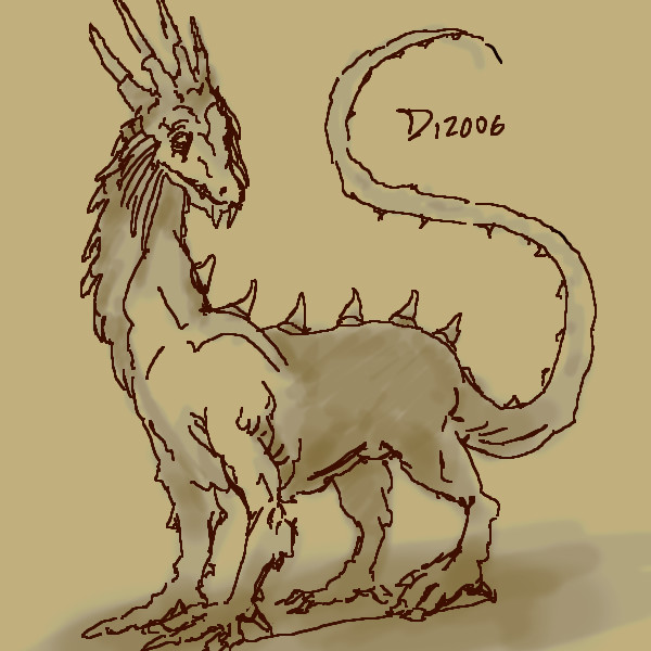
comd
(Mar 25, 2006)
I was thinking about dragons, unicorns, and dinosaurs.
DoOp (Mar 25, 2006)
that's a lovely creation you got there :)
~Wolf~ (edited Mar 25, 2006)
This is awesome it is good to see something different and creative on this site once and a while. (8
Sasuke-fan-Sapphire (Mar 26, 2006)
this is very awesome! It's so creative, I love it! o.o |
| |||||||||||||
| ||||||||||||||
| 2draw.net © 2002-2026 2draw.net team/Cellosoft - copyright details - 1.59sec (sql: 30q/0.87sec) |
I pretty much knew this picture wasn't what I should have been doing when I started on it based on my goals, regardless of the grid (though the grid made it that much worse). I set out only to draw the reference as accurately as possible and nothing more. In that sense, it's one of my biggest failures since that's the last thing I want to be doing in the future as I progress. I didn't even try to experiment with painterly techniques - I was trying to be as unpainterly as possible in this one so that it would look just like a photo. Generally I get the most comments about the painterly aspects of my works when working from photos, but this time I really wanted to try not being painterly (I tend to be painterly for economical purposes, not intentionally). I didn't even really achieve the photorealism I intended to achieve despite the use of the grid for the line drawing, so I didn't even succeed in that respect. While it's completely against my personal goals, I still admire the artists on here who can make their paintings look just like a photograph. I was hoping to achieve it here, but I think I deviated too much in the shading and still relied too much on lines which gave that sort of cartoony effect in places.