| |||||||||||||||||||||||
| Public Boards/Beginner | |||||||||||||||||||||||
|
NOVEMBER93
(Apr 8, 2006)
xxx |

| ||||||||||||||||||||||
| Public Boards/Intermediate | |||||||||||||||||||||||
|
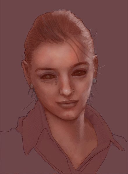
comd
(Apr 8, 2006)
Just a doodle of someone I don't know. Ref: http://www.feebonics.org/images/portrait_ref.jpg. I was chatting with Marcello about Lascaux while drawing it, so I didn't spend quite that much time on it.Like the William Dafoe one which turned into some dark warrior elf thing, I didn't bother so much to draw the person in the picture (though I was a little less sloppy this time). Halfway through the picture, I started seeing some resemblance to Connie Nielsen, so while I wasn't deliberately trying to make it look like her, I did start thinking about her halfway through the drawing and that probably had some influence. I didn't deliberately try to change much this time. The only place I consciously and deliberately changed was the neck area (I really like long necks). The rest is just inaccurate. The upper half of her head and her eyes bother me a bit, but I started rendering the details in those places too early and it'd be a pain to change them now. The line work is pretty bad. I'm really uncoordinated with my graphics tablet. The picture frame was a challenge, and maybe I should remove it. I just wanted to try making rounded corners with a fillet style effect, so I drew four circles and just drew tangent lines with the line tool. To make the lines look smooth, I used a thicker stroke with lighter opacity first rather than using antialiasing.
Sweetcell (edited Apr 12, 2006)
This version is so much better, as you say the hatching can add age. Your works looks like a combination of mediums, chalk, cante craoyn, watercolor, and pen amoung other things. Gad your good comd.We women have always been frustrating hmmm? *giggle*
DoOp (Apr 13, 2006)
woh, so pretty ! the hair really really reallly... i want it >_> plus the nose ring is pretty and stuff =) she's really pretty >^< <3<3<3
woah_pockster (Apr 13, 2006)
at first I thought it was one of joe's :0you did a wonderful job with this dear I really enjoy looking at this<3
kayla (Apr 13, 2006)
The drawing's crazy, the coloring's crazy, the color scheme is crazy... this whole drawing is so awesome! I love the way you shaded it.I understand how you feel on using tablets. The drawings I do on the computer always look so much worse then the ones I do on paper. |
| ||||||||||||||||||||||
| Public Boards/Beginner | |||||||||||||||||||||||
|
Maiko
(Mar 26, 2006)
"Zaaack, what did we say about yelling out plans for world domination? >:\"
Zack (Apr 8, 2006)
How could I possibly miss this? O_oYou're right, I shouldn't yell out like that, but sometimes I just get so excited thinking about it that I can't help myself. >_>
Akechi456 (Apr 9, 2006)
This is so cute,Mai-san~Zack teh monkeh looks so cute yelling out his ebil plans for world domination~xD You should put this on a shirt and on the back put;"Beware.Zack's watching you." Awesome job!
NOVEMBER93 (May 3, 2006)
I watched the animation...and o my god! you are the most awesomest person on 2draw...along with Hakkai and DoOp
Knockoff (May 3, 2006)
This is great, but i'm awesomerest :O |

| ||||||||||||||||||||||
|
gerbear
(Apr 3, 2006)
New here. Would welcome advice on the hair. Used the blender and set the opacity low, but it still looks really fake.I reworked the hair and it looks more natural now I think. I didn't realize you could go back into a "finished" drawing.
tandrew971 (Apr 20, 2006)
i really like that about this site..being able to go and fix something even after its finished. the hair looks great (as does the rest)
Meno (Mar 7, 2008)
Whaddaya talkin' 'bout? I like the hair .... like golden strands of wheat.
QTgillie (Jun 23, 2009)
i think how the hair is finalized is fabulous. |

| ||||||||||||||||||||||
| Specialty Boards/Elite Bastards | |||||||||||||||||||||||
|
15 comments
– latest 4:
fleeting_memory (Apr 5, 2006)
Its Kasha! Knew it was yours fromt the thumbnail
Pakasutemanshikuka (Apr 6, 2006)
Aaah! Finally some art from my alltimefavouriteartist :B~I am in love with the face! It is just brilliant XD!
frootcake (Apr 6, 2006)
how did you spend the money from that painting you sold? we all know thats what you've been doign all this time. hope you had a good time with it.this pic is like a chalk life drawing, its really fresh and inter--- i really can't think of the word i wana say, i've been sat here 5mins tryin to remember, im sorry. i do like the pic tho :)
DoOp (Apr 6, 2006)
I looked at your drawings and homg, they're all so good =) i love your art <3<3<3 and as everyone else says, welcome back =D |

| ||||||||||||||||||||||
| Public Boards/Advanced | |||||||||||||||||||||||
|
comd
(Apr 2, 2006)
Trying a bit more than a head this time since I have all this canvas space in the advanced section. I'm just going to try to copy the photo directly this time as closely as possible.http://www.kristiaknowles.net/images/gallery/fitness/fit2.jpg I'm not sure I'll get anywhere. Thanks all for the encouragement. [Edit] This is the opposite of what I'm striving to do artistically as my goal is to draw more loosely from references (using information from the reference to make a completely different picture, not drawing the reference) and ultimately without needing references at all, but I wanted to try a shot at being unpainterly and more photorealistic: the antethesis of what I've been trying to do. To get the line drawing and major landmarks as accurately as possible, I initially started with a grid for the line drawing. This allowed me to shade and color more loosely without worrying about correcting inaccuracies from the previous stages. I don't think I quite got there as I still got lazy on the shading and didn't quite interpret the values correctly. It looks correct sized down, but not up close.
Zack (Apr 5, 2006)
You might find it an interesting exercise to take a ref and try drawing it at a different angle. As soon as I have more free time I intend to make a number of drawings that are loosely referenced like that; maybe they have the same angle but different lighting, or they have different shading styles, etc. Personally, I see loose references as training wheels and strict references as crutches, but that's in terms of my own artistic goals and not a criticism of other artists here. In light of your goals, I'd say dropping the grid system is probably a good idea.
comd (edited Apr 5, 2006)
Modifying angles, lighting, or the original 3D form of the reference is the kind of stuff I'd like to ultimately do when using references. Just anything that demands the 3D form is understood so that it could be used to produce other 3D forms is what would benefit me most. I tend to be more 2D-oriented when copying photos regardless of whether I'm using measuring devices or just freehanding, and that's useful for copying 2D images, but not for inventing 3D ones. I tend to ask questions like, "what's the 2D shape of this highlight? How does it relate vertically and horizontally to this other mark?" Rather than, "what's the 3D form of this figure"? If I understood the 3D form, then I could invent my own highlights without using the precise shapes in the photograph.I pretty much knew this picture wasn't what I should have been doing when I started on it based on my goals, regardless of the grid (though the grid made it that much worse). I set out only to draw the reference as accurately as possible and nothing more. In that sense, it's one of my biggest failures since that's the last thing I want to be doing in the future as I progress. I didn't even try to experiment with painterly techniques - I was trying to be as unpainterly as possible in this one so that it would look just like a photo. Generally I get the most comments about the painterly aspects of my works when working from photos, but this time I really wanted to try not being painterly (I tend to be painterly for economical purposes, not intentionally). I didn't even really achieve the photorealism I intended to achieve despite the use of the grid for the line drawing, so I didn't even succeed in that respect. While it's completely against my personal goals, I still admire the artists on here who can make their paintings look just like a photograph. I was hoping to achieve it here, but I think I deviated too much in the shading and still relied too much on lines which gave that sort of cartoony effect in places.
frootcake (Apr 6, 2006)
omg biggest posts ever. great pic and i've been a victim of the grid in the past. when the masters of the past were working on frescoes - they couldn't draw straight from life, so they did their preliminary drawing and they would grid that whole wall up before doing some of the greatest paintings ever made, theres no shame :):)
HunterKiller_ (Apr 7, 2006)
Mmm... (damn you essay writters.) |

| ||||||||||||||||||||||
| Public Boards/Intermediate | |||||||||||||||||||||||
|
chan2005
(Apr 4, 2006)
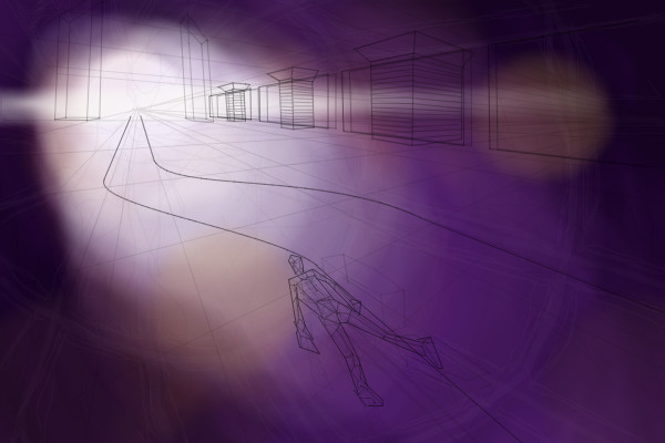
Videogame inspired image (particularly one called Rez - an audio-visual extravaganza!), complete with naked flying polygon person. hope to add some more stuff cus it looks real empty atm
chan2005 (Apr 4, 2006)
lol just typed 'Rez Orgasm Game' into google. Damn there goes all my credibility. Yeah, I think Rez is pretty funky. The Tron-like graphical style and whole idea of tying music, gameplay and visuals together is coolio.
Renuar (Apr 4, 2006)
good idea chan. looks ultra
LisaAnne (Apr 6, 2006)
I didn't read anything you wrote, but I like this. It tickles. Its visually appealing and different.
frootcake (edited Apr 6, 2006)
lol pwned by lisa. damn i wana draw something in this style. a few more pics and you'l be one of my faves on the site in no less that 10 drawings! you bitch!btw the thumbnail looks cool too :) |
| ||||||||||||||||||||||
| Public Boards/Beginner | |||||||||||||||||||||||
|
comd
(Mar 12, 2006)
Just starting out. It transformed quite a bit: the original picture was a doodle I made when I was starting out, and I hated it, so I drew over it and made a pseudo-caricature (not really a caricature since I hardly exaggerrated anything) of a guy I know. Reference photo: http://www.feebonics.org/images/genia4_photo.jpg.
pandabarrie (Mar 13, 2006)
ohh!! color! one of your two that are colored :D told you i liked this one! still doI didn't like the original picture: it was something I tried when I was starting out, and it was a pretty ugly sketch to start coloring, so I ended up doing a quick pseudo-caricature of a guy I know.
DoOp (Apr 4, 2006)
from that to KFC XD funtastic :)
Zack (Apr 4, 2006)
Haha! Excellent! |

| ||||||||||||||||||||||
| Public Boards/Advanced | |||||||||||||||||||||||
|
Opium
(Apr 1, 2006)
.
patienceisoverrated (Apr 4, 2006)
I like the skin texture you added. I like his wrinkles, too.... people with wrinkles are intresting to draw. It's like, all their life experiences and feelings and whatever are written on their faces.
Sweetcell (Apr 4, 2006)
I think you can be a believer of both, and I am. Being Roman Catholic myself I learned about His creation and evolution, and it's funny it seemed easy for me to blend the two, meld it if you will. I believe He exists and created the Earth and everything around us, but I also believe in the Big Bang and evolution... hmmmm maybe that makes me a bit by-polar. That would explain things.You can have Creation and Evolution, I believe it. Maybe someone just needs to find the middle where both fits. Awesome piece Opium, love that hair. He does look tired.....
gerbear (Apr 5, 2006)
Excellent portrait! Very impressed with it.
Opium (Apr 5, 2006)
Thanks Marcello, patience, sweetcell, and gerbear! :) |

| ||||||||||||||||||||||
| Specialty Boards/Elite Bastards | |||||||||||||||||||||||
|
Zack
(Mar 11, 2006)
Ok, so it ended up not being really all that anime-like. More of a freakish hybrid. It was fun working on it though.homg 14 layers. references: knife rusty door wall texture character lighting |

| ||||||||||||||||||||||
| |||||||||||||||||||||||
| 2draw.net © 2002-2026 2draw.net team/Cellosoft - copyright details - 3.37sec (sql: 41q/2.55sec) |
drawn in 51 sec
drawn in 15 min
drawn in 5 min
drawn in 12 min