| |||||||||||||
| Public Boards/Advanced | |||||||||||||
|
Kloxboy
(Mar 8, 2004)
this will be me..you've been warned..just wait till I ad the glasses.. |

| ||||||||||||
| Public Boards/Intermediate | |||||||||||||
|
concannon
(Feb 28, 2004)
This had been sitting in my studio for an obscenely long time, and I just needed to finish it. -___- I know it could stand more details...maybe I'll go back in later. Depends on what everyone says. Right now, I'm far too lazy.
davincipoppalag (Aug 9, 2004)
Ah nice birdy VV!, They're a pain to do with all the details it requires.. keep working on it!
Sumomo_chan (Sep 3, 2004)
awesome! Betcha you don't know me, but i'm your sister's friend, sumomo. You commented on one of my drawings....O_o
concannon (Sep 3, 2004)
Oh, I know who you are. *eyes* Apparently you're the one that came up with the idea for "saki" as the name of your band with Katie and Maerna that may never happen.
Dragnakita (edited Sep 12, 2004)
xD The birdy is awesome. But, there are no clouds... ha ha ha... |

| ||||||||||||
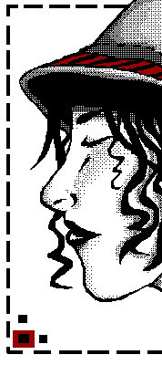
|
quintessence
(Mar 6, 2004)
Solid lineart rules you all.
dixielandcutie (Mar 6, 2004)
oh man i like that a lot. and yes that is some rockin solid lineart. i love the red contrast too!
ProjectZeppher (Mar 6, 2004)
incredible.... *wants brain*
ambermac (Mar 21, 2004)
amen! nice illustration. reminds me of 80's zipatone art.
bumpinthenight (Jun 14, 2004)
heck yeah!!! i do solid lineart all the time... you rock, quintessence.... wootiness.... |
| ||||||||||||
|
Gothic_Otaku
(Mar 14, 2004)
Still needs work, and I am aving trouble with the shading. I have to go to bed now, des anyone know how I can improve this?
STAR_WARRIOR (Mar 15, 2004)
I like it. I like the face, though Im not really likeing the pink.
DMV (Mar 15, 2004)
I like the BG...the pink skull rules. hmmm maybe i should try drawing a skull? if you wanted to you could thin out your lineart it would make more shapley.
Gothic_Otaku (Mar 19, 2004)
Actually this is me. This is a self portrait of me, and that is an actual shirt I have.
bumpinthenight (May 25, 2004)
Ehhhhh... Tis ok.... The face could use some work.... There are websites that give tutorials on how to draw anime faces....Also, you should draw in some tendons in the neck... It gives more dimension to the drawing.... :) |

| ||||||||||||
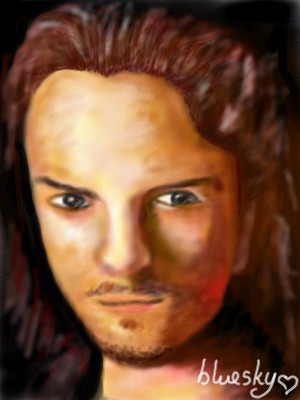
|
bluesky
(Mar 10, 2004)
umm i might not be able to draw on this again until a little whiles later, so please i beg on my knees don't delete!ehh first realism pix...bleh nothing compared to gigandas's legolas! hey lily, remember what i said about trying this out? ughh that mouth is killing me... probably doesn't look much like the ref pix...well i tried, and that's what counts for me! ^^ here's the ref pix: http://www.thai.net/smorking2003/poster/inter/Orlando%20Bloom.jpg
dixielandcutie (Mar 17, 2004)
that is a very good job! looks a lot like him too :) keep it up!
laurael (Apr 6, 2004)
Nice job for sure...like it a lot.
rainstar (Apr 21, 2004)
it's amazing, blusky! wow, i wish i could do that...check out my new piece-i didn't mention this in my comment on it, but it's dedicated to you, bluesky!
bumpinthenight (May 25, 2004)
tis goot, but the nose needs alot of work.... Also, the colors should be much more defined for a more dramatic appearance... I dunno.... |
| ||||||||||||
|
ProjectZeppher
(Mar 6, 2004)
sort a sketch i did...... just fooling around- but it turned out pretty well methinks
Deformed (edited Mar 12, 2004)
Oh wht do you have to torture meeee!!
ProjectZeppher (Mar 13, 2004)
Mwhahah!
secert (Mar 13, 2004)
wowzer that is pretty danm.
bumpinthenight (May 25, 2004)
The darker colors of the second version definately suit this picture more.... But man, does that dude need some crest whitestrips! |
| ||||||||||||
| Specialty Boards/Elite Bastards | |||||||||||||
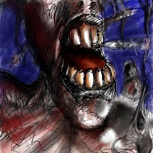
|
method3
(Sep 27, 2003)
Tripping the light fantastic...-------------------------------- The first edit went over the 800kb limit on the advanced board, so it is therefore ending up on the elite bastard board because I really don't have a choice. At least it seems submittable, although notably still abstract and un-interesting for the most part.
dixielandcutie (Mar 10, 2004)
lol, davinci. i do like what you're doin with it! keeeep it up!
ProjectZeppher (Mar 11, 2004)
this sucks...
Maiko (Mar 13, 2004)
teh head's a bit big O_O;; an' her body is kinda scary ^^;;but i like the lineart, very smooth
bumpinthenight (May 25, 2004)
Woah.... Good anatomy.... Interesting headpiece you got there, too! (or is it a headpiece... :P) |

| ||||||||||||
| Public Boards/Beginner | |||||||||||||
|
foxman8245
(Mar 6, 2004)
Just a thing with stitches, holding itself together.
ProjectZeppher (Mar 6, 2004)
i like... sexy
davincipoppalag (Mar 6, 2004)
I like your background and I think its an interesting face lol he should have tried duct tape instead of stitches.. duct tape fixes anything
sal (Mar 6, 2004)
cool pic... i like ur choice of colours.... they work well together... interesting idea....
foxman8245 (May 4, 2004)
I'm gonna have to do another one of these and use duct-tape LOL |

| ||||||||||||
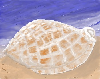
| Public Boards/Intermediate | |||||||||||||
|
davincipoppalag
(Mar 3, 2004)
This was a special request from "mah frayund down Noth K'Lahna way" It's the state shell of North Carolina.
ProjectZeppher (Mar 6, 2004)
pretty hot stuff...i wish i could do that sorta implied lighting...or would subtle be a better wiord.... __anways __ tis good i say
DinoFlorist (Mar 6, 2004)
nice shell and the background is awesome sand. I love water stuff. You should do another cool shell and then put a turtle inside of it.
Look (Mar 8, 2004)
Nice texture on the shell!!! It's almost transparent. I love how you drew to sea too! It's beautiful!
Pandora (Apr 2, 2004)
Anything with the sea in it I love. This shell makes me want to pick it up. Beautiful |
| ||||||||||||
|
supermimi
(Mar 13, 2004)
To be deleted... |

| ||||||||||||
| |||||||||||||
| 2draw.net © 2002-2026 2draw.net team/Cellosoft - copyright details - 0.43sec (sql: 40q/0.22sec) |
Your shading is always so nice!
Great job, esp on the hair!