|
| |||||||||||||||||||||||
| Public Boards/Beginner | |||||||||||||||||||||||
|
just for fun
Miss_DJ
(Nov 3, 2007)
stage 1
Kloxboy (Nov 3, 2007)
Fun stuff. Looks like a cover for a techno album.
PS (Nov 4, 2007)
This is such a neat design. Great job!
Pantera (Nov 4, 2007)
Pretty colours i like it :)
Miss_DJ (Nov 5, 2007)
thank you all very much! |

| ||||||||||||||||||||||
|
Felistorm
(Nov 3, 2007)
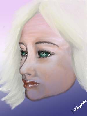
the hair sucked but I think the face came out how I wanted it. First drawing I've gotten to do in a long time due to lack of tablet LOL.
PS (Nov 3, 2007)
Nice portrait for 31 minutes. |
| ||||||||||||||||||||||
|
ittykitty
(Nov 3, 2007)
>.<
PS (Nov 3, 2007)
Nice job on the face and hair, the body could use a little more work. |

| ||||||||||||||||||||||
|
camadeon
(Nov 3, 2007)
behold ....my blending powers.... |
| ||||||||||||||||||||||
|
girlrandomo
(Nov 2, 2007)
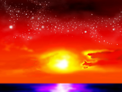
my 2nd online piece.. whooo.i messed up on the water .. can i fix that? please comment. I would really appreciate it.. i've never had an art criticism before.. o_0 =] THANKS YAH.
enjoydotcom (edited Nov 2, 2007)
the top half is very nice, the bit under the sun needs a bit more work.
PS (Nov 3, 2007)
I agree, the sky is great, and yes, you can press the "revise" button underneath the versions to work on it some more. |
| ||||||||||||||||||||||
|
girlrandomo
(Nov 2, 2007)
weird flower. |

| ||||||||||||||||||||||
| Public Boards/Intermediate | |||||||||||||||||||||||
|
backmagicwoman
(Oct 24, 2007)
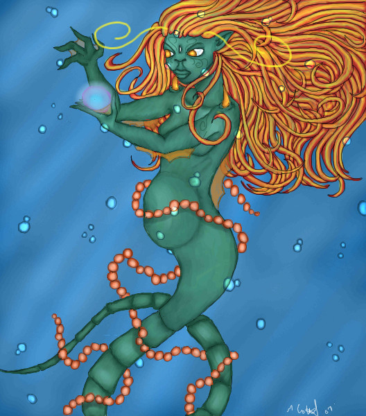
still working on it..
PS (Nov 3, 2007)
Very nice lines and coloring, this is great work.
backmagicwoman (Nov 3, 2007)
Thanks..:D
Pantera (Nov 4, 2007)
Wow, i love it, great job:)
Aakyra (Apr 21, 2008)
This was well worth the wait! She is gorgeous!!!!! |
| ||||||||||||||||||||||
|
JK-Arts
(Nov 2, 2007)
.
Fiesta (Nov 2, 2007)
I cant explain how much I love this.Its just so soft and pretty yet realistic... Amazing. :)
PS (Nov 3, 2007)
The way you did the sunlight on the clouds is really nice. It does look a bit sketchy overall, but you could just call it style since it appears that is how you wanted it to look.
JK-Arts (Nov 3, 2007)
Yes a color pencily-style is what I was going for. |

| ||||||||||||||||||||||
| Information/News | |||||||||||||||||||||||
 |
marcello (edited Nov 12, 2007)
Hey all! I am happy to finally announce a new 2draw.net project, the 2draw art book project! What is this project, you ask? Well, it is a book! Full-color, hard-cover, high-quality book like you'd find in any nice bookstore. And what's in this book? Art from 2draw.net! Over the next two weeks we will be selecting artwork from the entire archive of 2draw.net drawings to be included in the book. And you get to help! How can you help? Nominate drawings for inclusion in t...
139 comments
|
||||||||||||||||||||||
| Public Boards/Intermediate | |||||||||||||||||||||||
|
Zer0
(Oct 29, 2007)
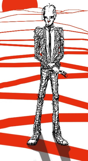
i gotta erase somethineverytime I hit submit I see mistakes
Kloxboy (Oct 29, 2007)
I like this, it's simple but totally effective. I like his wire-mesh legs, reminds me of Giacometti's style. I like how your work is structural, it stands out among most of the work here.
PS (Oct 30, 2007)
This is great, very original.
Pseudonymous (Oct 30, 2007)
He's painting the town red! I agree with Klox. This is very well done. This makes me think of "Fahrenheit 451". |
| ||||||||||||||||||||||
| |||||||||||||||||||||||
| 2draw.net © 2002-2026 2draw.net team/Cellosoft - copyright details - 1.22sec (sql: 37q/0.82sec) |

