| ||||||||||||||
| Misc. Boards/Sprites | ||||||||||||||
|
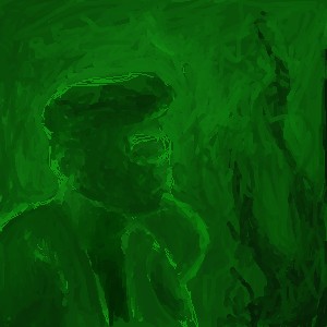
Thug
thug
(Feb 9, 2004)
self portrait
marcello (Feb 9, 2004)
looks like sam from sluggy...
dixielandcutie (Feb 9, 2004)
cool beans...*shudder* red eyes? OOOoooOOO love the sketchy look
MC.Cracka (Feb 12, 2004)
purely hot pants
strangeoid (Feb 14, 2004)
XD OMG! It does look like Sam from Sluggy.... great eyes. *is sufficiently creeped out* |

| |||||||||||||
| Public Boards/Intermediate | ||||||||||||||
|
MC.Cracka
(Feb 9, 2004)
My first truely serious drawing at 2draw.Sis needs to use the phone, yes i use a 56k modem
finally seing some good progress with the shading. I also fixed some of the nasty black globs.
Edward (Feb 12, 2004)
the shadding is really goodbut the line art neds more work it is very pixilized and does not hel your picture at all. Over all i think you should stick with the intermediate board for now.
MC.Cracka (edited Feb 12, 2004)
im going to fix the line art, tring to get the shading in. most likely when im done there wont be any black lines |

| |||||||||||||
| Public Boards/Beginner | ||||||||||||||
|
DinoFlorist
(Feb 12, 2004)
my last two draws have scared me! They're not even spiders.
MC.Cracka (Feb 12, 2004)
weird in a good way
davincipoppalag (Feb 13, 2004)
dino is in a green phase... i like the imagination of your pictures |
| |||||||||||||
| Public Boards/Intermediate | ||||||||||||||
|
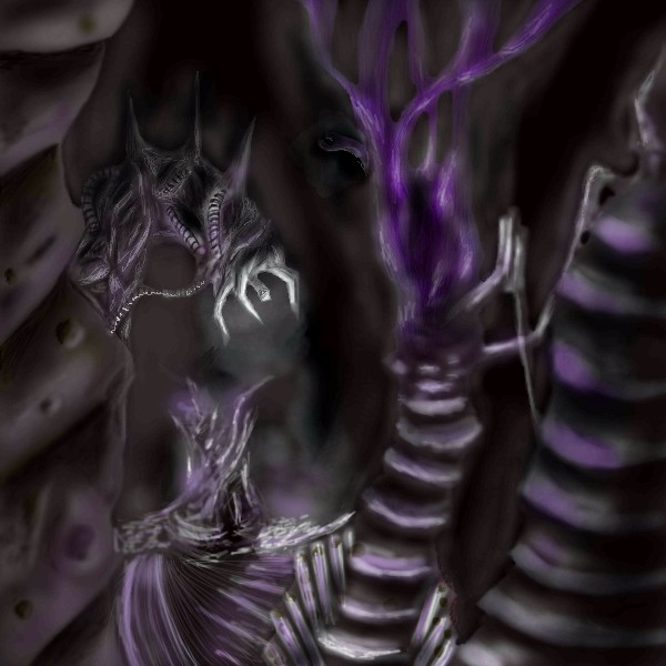
Fin_beast
(Dec 9, 2003)
|*|CAN A MOD PLEASE GIVE ME MORE SPACE PLEASE! =D |*|Erm...this is gona be my art final piece..... I'm trying 2 encorperate Giger, Electron Microscope Stuff and kinda a fuse between organic things and robotics. You have yet to see if this works.... Well..... I am pretty pleased with how this came out. I am very pleased I made it all very much darker...
Gigandas (Feb 9, 2004)
Wow....looks like some dungeon you'd see in the FF series.....very cool....
Soshell (Feb 10, 2004)
wow...this is awesomely awesome! i liked the wires you had before but i like the end result alot too
MC.Cracka (Feb 10, 2004)
cool concept, and shading
Fin_beast (edited Mar 4, 2004)
Cor.... I've come a long way...I just went through all my sh*t... and by god have I improved just a little. |
| |||||||||||||
| Specialty Boards/Collaborations | ||||||||||||||
|
We're using references of cinematic scenes from FF9 to help us create this drawing.
16 comments
– latest 4:
Chiyo-chan (May 6, 2005)
But why would you say that? 9 is better because.... you know now that I think about it I don't know why I like 9 so much....[Chiyo] Good God that scared me I thought I'd screwed up Blank-just turns out I had white spots on a different layer. Sorry I suck at this applet
ug too tired-sorry :(
Totally listening to the soundtrack while I do this ^_^
|

| |||||||||||||
| Public Boards/Intermediate | ||||||||||||||
|
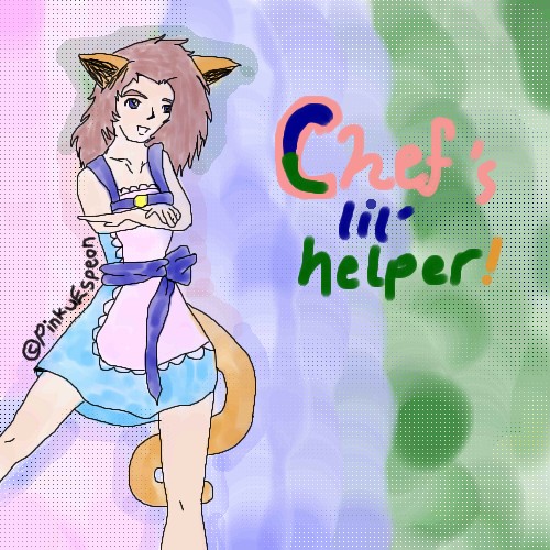
PinkuEspeon
(Feb 10, 2004)
Oh... I'm not finished with this... but... hey! It's turning out pretty good! ^_^;; VERY unlike most of my images! Eh heh heh... I am improving rapidly. Don't you agree? ^_^;;... uh... I will get finished with this soon... very soon. Very... like tomorrow or the next day type soon... :D Uh... oh... kay? Uhm... yeah... I can't wait until I'm finished!! This is the first picture that I have ever drew that I am actually happy with!! ^_^;; Uhm... yeah... ah hah hah!! :DOkay! I've finished the final outline! ^_^;; ...uh... uhm... eh heh heh? This is good enough... :p Oh... and... aww... thanks ToraNeko!! :D
Uuuuuhm... uh... I added color? As you can see... -_-;; I am a VERY, VERY sloppy colorer or whatever... BLEH.
marcello (Feb 14, 2004)
that copyright notice is really tacky...
PinkuEspeon (Feb 15, 2004)
Ah, thanks, Marcello! :) |
| |||||||||||||
|
staci
(Feb 10, 2004)
This is mo betta.
Childlike_Vampire (Feb 10, 2004)
I'm liking this very very, minds me of the view across a field in the morning in the country...one of the only reasons I might actually miss the country...beautiful piece.
staci (Feb 11, 2004)
thanks yous guys. : )
DeadlyBlondeArcher (Feb 11, 2004)
I like this alotskly. Kinda reminds me of some desolate places in New Mexico. Watched the animation, 2 - that's neato!
fleeting_memory (Mar 2, 2004)
*gapes* blinks*gapes again* It looks like one of those times when you look up in the sky and you go "Wow that is so beautiful I wish I could take a picture of it" Me likey |

| |||||||||||||
| Public Boards/Beginner | ||||||||||||||
|
6 comments
– latest 4:
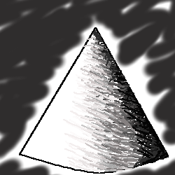
ArtMageDreams (Feb 11, 2004)
I did this kindda thing in my Color and Design art class... well.... you've got something just a bit off course on your "cone" because... if you wa-- oh nevermind.... -_-; *cannot explain it well enough* well.. it's good! just needs alittle shadow on the bottom or something... I guess... but... I LIKE IT!!!!
PinkuEspeon (Mar 12, 2004)
Triangles aren't curved. I do like the shading, though.
davincipoppalag (Mar 12, 2004)
um...a curved triangle is a cone..no?
Edible_weasel (Apr 6, 2004)
GJ! its a... pyramid! |
| |||||||||||||
| Public Boards/Intermediate | ||||||||||||||
|
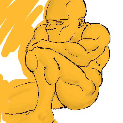
Vinegar
(Jan 3, 2004)
It looks unfinshed, but Its what I was going 4... More anatomy, didnt go all out on detail, but I can use any practice i can get
darkk_angel (Jan 4, 2004)
erm, dude... just to tell you... this should be on the practice boards if it is to practice something...
MC.Cracka (Jan 9, 2004)
its good, but like he said you should have put this on the pracice board. Also it wouldnt hurt to give him some pants.
furyofroy (Jan 9, 2004)
I think it's fine for intermediate. critique: The head looks big for his body, and the leg look very unnatural. But I like the arm very much so. |
| |||||||||||||
|
Yair
(Jan 7, 2004)
Yet another sequal?Gheeeh...
MC.Cracka (Jan 9, 2004)
good but stale shading, get to know the blur tool it helps a lot |

| |||||||||||||
| ||||||||||||||
| 2draw.net © 2002-2026 2draw.net team/Cellosoft - copyright details - 1.20sec (sql: 45q/0.34sec) |